
If you’ve been staring at paint swatches and wondering why your bathroom still feels a little “off,” this guide will help you explore bathroom decor color ideas that look good in real-life lighting. We’ll move through soft neutrals, earthy greens, rich jewel tones, muted pastels, and bold modern shades, along with a simple way to choose a palette without completely losing your mind.
It’s 10:22 p.m., and I’m standing in my hallway bathroom in socks, holding a paint fan deck like it’s a legal document. I’m deep in that decorating spiral where you quietly ask, “What even counts as white?” while your dog watches you like you’ve officially lost it. Honestly, fair.
If you’re searching for bathroom decor color ideas, I completely understand. Bathrooms are usually small, reflective, and surprisingly unforgiving. They have mirrors, glossy surfaces, and overhead lighting that sometimes feels like it was designed to expose every flaw imaginable. Then there are water spots, toothpaste splatters, and the one towel you could swear you washed that somehow still smells faintly like a swimming pool.
So instead of choosing a color because it looked beautiful on a tiny paint card, let’s approach it the way real people actually decorate: by considering the mood you want, the amount of natural and artificial light, how much cleaning you’re willing to do, and, most importantly, how chaotic your household gets on a Tuesday morning.
Soft Neutrals that Still Feel Like You Live There
Soft neutrals are definitely having a moment, but I’m not talking about that flat, lifeless greige that makes every room look like a waiting area. Think warm off-white, creamy beige, putty, sand, mushroom, and those soft earthy shades that make a bathroom feel comfortable instead of sterile.
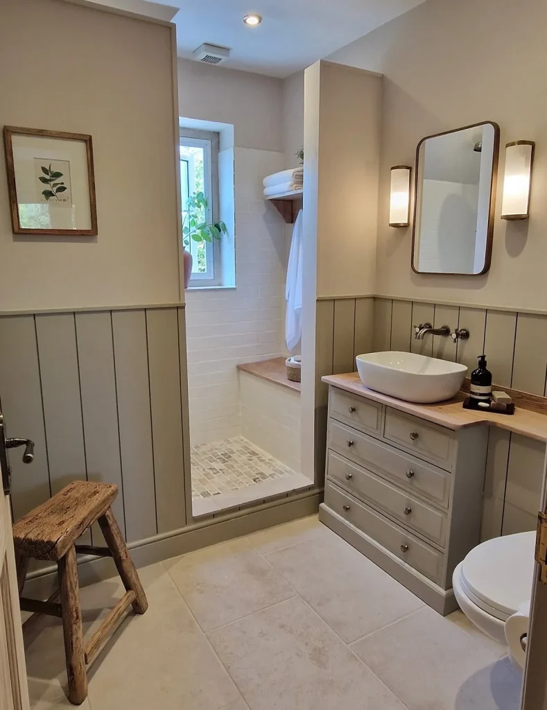
One of my favorite combinations is a small shower room with cozy beige walls on top and a green-gray paneling below. The lower color has that soft, natural look of wet river stone, while the warm wood countertop adds just enough richness. Clean white tile keeps everything fresh, so the finished space feels relaxed and spa-like without becoming overly polished.
It’s such a good reminder that neutral doesn’t have to mean boring. You can layer different shades, materials, and textures to create a room that feels soft, warm, and personal.
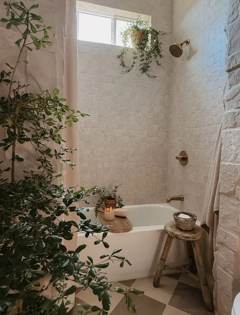
Another neutral combination I love is a creamy, stone-inspired bathroom with textured walls, a simple wooden stool, and a few plants. The whole palette feels like biscuit, linen, oatmeal, and warm cream. Add a candle and suddenly the bathroom feels like the kind of place where you intentionally take a long bath instead of simply standing there wondering where the toothpaste went.
If you’re working with a small bathroom, choosing the right neutral undertone makes a huge difference. Warm neutrals pair beautifully with brass fixtures, walnut wood, creamy tile, and other warm finishes.
Cooler neutrals can look beautiful too, but they usually benefit from warmer lighting and natural wood accents. Without those warmer elements, a cool bathroom can quickly start feeling a little too clinical.
And remember, choosing a neutral doesn’t mean every surface needs to be exactly the same color. You can use half-wall paneling, slightly darker cabinets, or a ceiling that is a shade warmer than the walls to create that finished, designer feel without committing to an intense color.
I’m also a big believer in paint samples. Yes, I’m the person who tapes five sample pots to the wall and then leaves them there for days. But bathroom lighting can completely change how a color looks, so testing first is worth it.
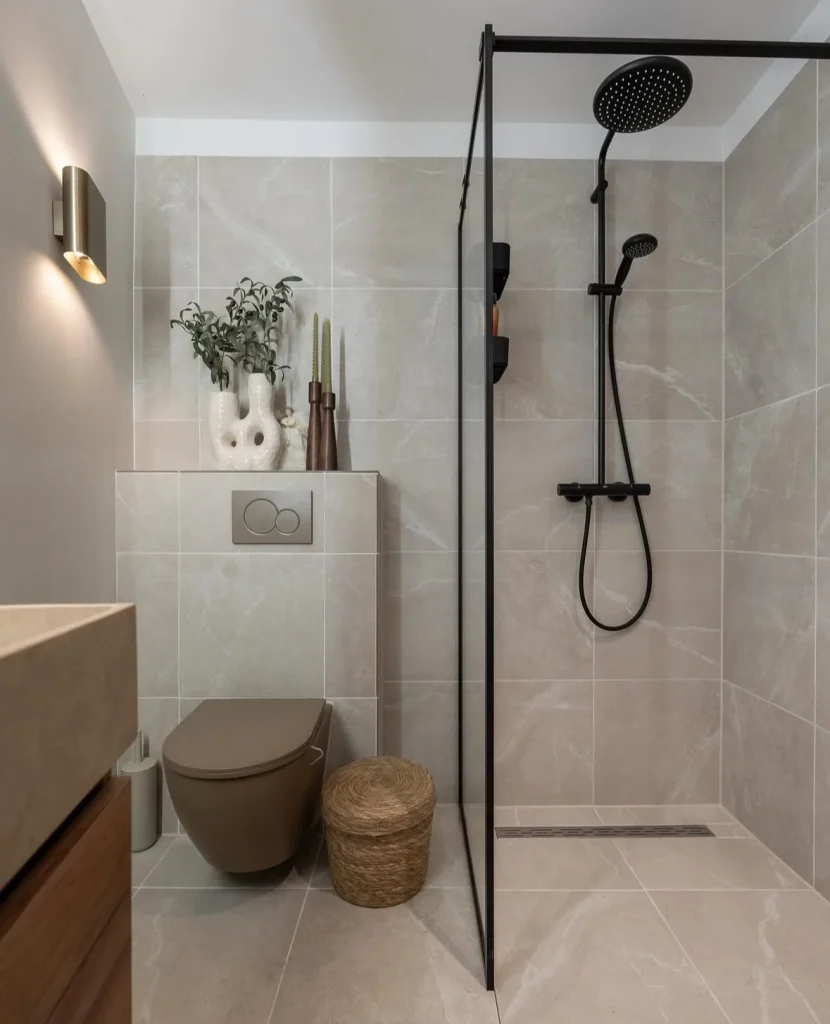
For another quietly sophisticated option, try large pale tiles with matte black fixtures and a simple woven stool. The clean shapes and strong contrast create a modern look without relying on bright or dramatic paint colors. Sometimes the finish, texture, and contrast are enough to make a bathroom feel beautifully intentional.
Earthy Tones that Make Your Bathroom Feel Like a Little Retreat
Earthy tones are what I reach for when I want a bathroom to feel peaceful, warm, and connected to nature. Think olive, clay, espresso, sandstone, muted terracotta, warm brown, and soft green.

An olive-green bathroom paired with a graphic black-and-white floor can have so much personality. Deep green walls and a matching ceiling create a cozy atmosphere, while a black grid-style shower adds a modern edge. The patterned flooring brings in another layer without making the room feel chaotic.
Sage and muted green tiles are another great choice, especially when they’re paired with natural wood. Imagine a bathroom covered in soft green tile with a floating walnut vanity, warm brass fixtures, and a stone floor. It feels crisp and comfortable at the same time, almost like wrapping yourself in a really expensive robe.

The beauty of earthy green is that it can feel calming without becoming bland. Wood and stone help ground the palette, giving the room a natural warmth.
And then there’s brown. Brown is officially having its comeback moment, and honestly, I’m here for it. It can work as a surprisingly sophisticated bathroom color when you choose the right shade and balance it with lighter materials.
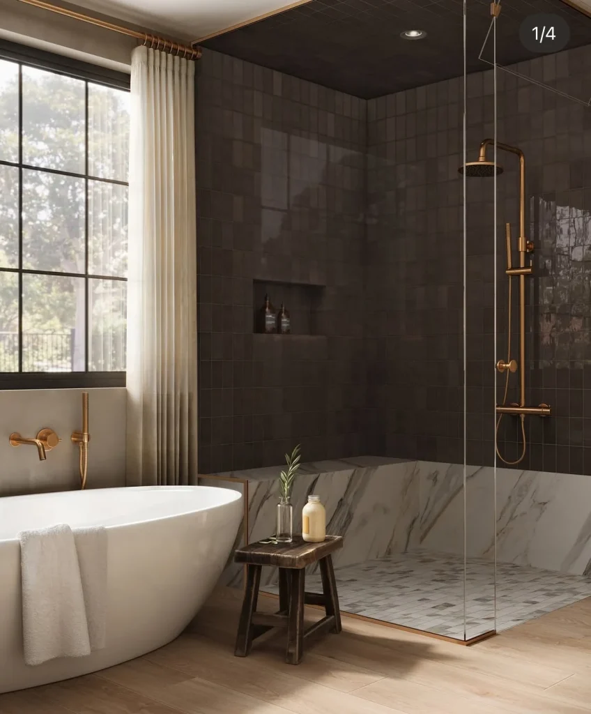
A dark espresso-tile shower combined with a marble accent, warm wood-look flooring, and brass fixtures can feel rich and dramatic without making the bathroom feel gloomy. The lighter stone keeps the darker color from becoming too heavy, while the warm metal adds a little sparkle.
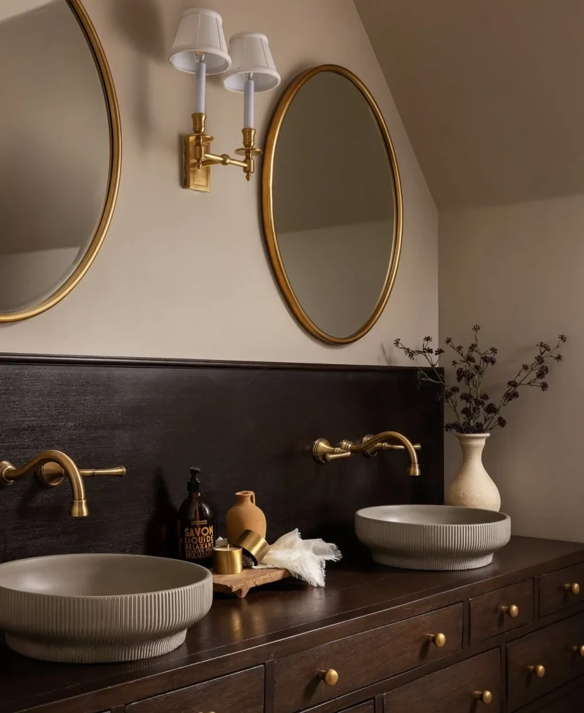
If you want an earthy bathroom without making it feel like a cave, natural wood can do a lot of the work. An espresso-stained vanity with warm brass hardware and textured vessel sinks creates a cozy, grown-up look. Ribbed surfaces and handcrafted-looking details add even more personality.
One important thing to remember with earthy colors is that texture matters. Natural bathroom colors tend to look much better when there are surfaces that catch and reflect light differently. Think satin paint, stone tile with natural variation, textured plaster, wood grain, or woven accessories.
If every surface is completely smooth and exactly the same shade, even a beautiful earthy color can start looking flat, especially in a bathroom that doesn’t get much natural light.
Deep Jewel Colors When You Want Drama in the Most Satisfying Way
Okay, deep jewel colors are definitely not for everyone, but when they work, they can completely transform a bathroom.
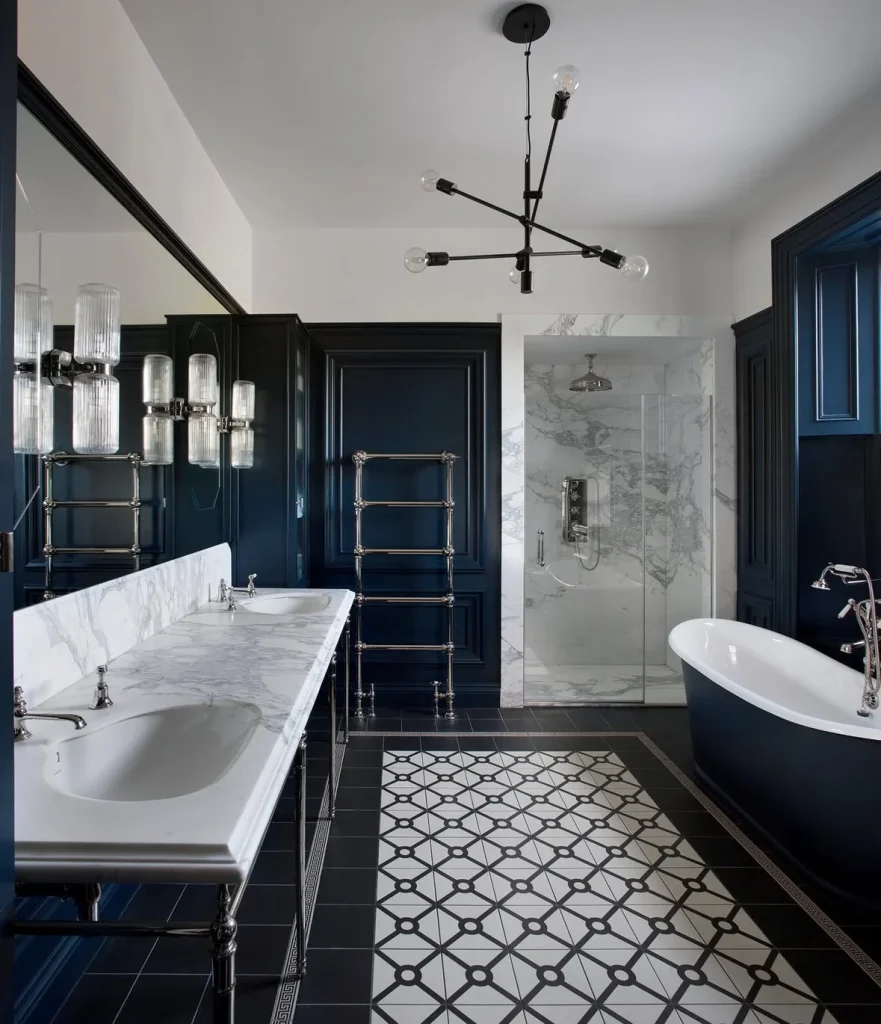
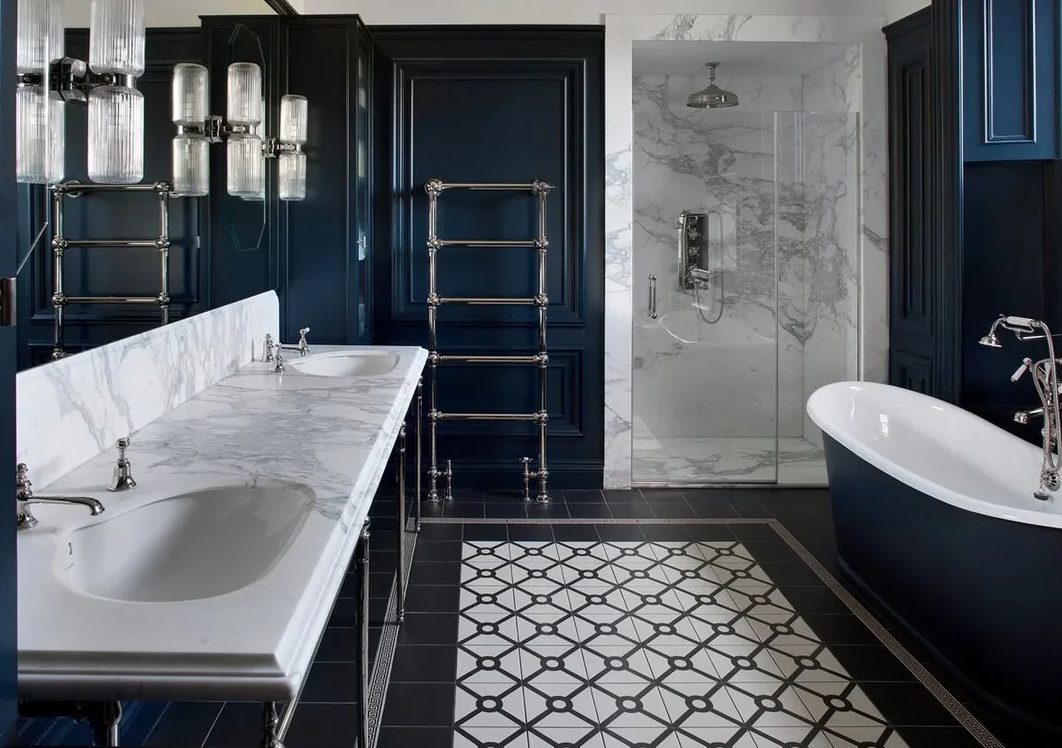
Deep navy is one of my favorite choices for creating a dramatic yet sophisticated space. Picture rich navy walls paired with a marble-topped double vanity, crisp black-and-white flooring, and bright marble in the shower. The dark walls make the lighter materials stand out beautifully, giving the entire room that polished, almost boutique-hotel feeling.
Jewel tones are especially fun in a powder room because you can experiment with stronger colors without committing to them throughout your entire home. A deep emerald vanity, an inky blue wall, or a rich plum shade can bring plenty of personality into a small space.
If you’re nervous about going all-in, start with one strong feature. Paint a single wall, choose a jewel-toned vanity, or use a darker color in the lower half of the room.
Lighting is especially important with deep colors. Jewel tones can look incredibly luxurious under warm, flattering light but much harsher under bright, cool lighting. So before blaming the paint, take a look at the bulbs too.
And yes, if your bathroom still has one of those harsh overhead fixtures that makes you look like you’re being questioned in an interrogation room, a softer bulb might be the easiest design upgrade you make.
Muted Pastels that Feel Grown-up, not Babyish
Muted pastels can be surprisingly sophisticated. They might sound delicate or overly sweet at first, but the right combination can make a bathroom feel playful, stylish, and full of personality.

A soft candy-pink herringbone tile paired with brass fixtures and a mustard-yellow tub is a great example. The pink brings softness, while the warm yellow adds energy and prevents the space from feeling too sugary. Decorative details and brass finishes give the whole room a little more character.
If tile feels like too much of a commitment, paint is an easier way to bring pastel colors into your bathroom. Try a soft pink above traditional wainscoting, or use a muted pastel in a powder room where you can have a little more fun with the design.
Pastels also work beautifully with warm metals and vintage-inspired shapes. Think rounded mirrors, classic sconces, curved accessories, and softly colored walls.
One practical rule I always keep in mind is to make sure the pastel works with your existing fixtures. If your bathroom has warm brass, warmer pastel shades usually feel more natural. If you have chrome or other cooler finishes, a cooler pastel can create a cleaner combination.
And if your bathroom has a random mix of metals because you’re slowly replacing things as the budget allows, don’t stress. Real bathrooms don’t always get remodeled in one perfectly coordinated weekend.
Bold Modern Hues and High-contrast Moments that Make the Whole Room Feel Intentional
Bold doesn’t necessarily mean bright neon or overwhelming color. Sometimes bold simply means choosing a shade confidently and using contrast thoughtfully.

Terracotta is a great example. A warm terracotta-tiled bathroom with a wavy mirror, brass fixtures, and a vintage-inspired wooden vanity can feel cheerful, warm, and incredibly inviting.
The rich tile color brings warmth into the room, while a patterned floor adds personality without competing with everything else. Curved shapes, natural wood, and warm metals make the space feel collected rather than overly coordinated.
Bold color can also come from smaller design decisions. A dark ceiling paired with lighter walls can create a surprisingly sophisticated effect, especially in a primary bathroom where you want the space to feel cozy and cocoon-like in the evening.
Matte black fixtures are another easy way to introduce contrast. They can make a bathroom feel instantly sharper and more modern. Just keep in mind that black fixtures can make water spots and mineral deposits much more noticeable, so if constant wiping isn’t your idea of fun, another finish might be more practical.
Then there’s the combination of classic materials with one dramatic element. A rich mahogany vanity paired with bold marble can create a striking bathroom without requiring a wall full of intense paint color.

Even the accessories can help pull everything together. Large leafy branches in a simple glass vase can soften strong materials and add a natural element to the room.
That’s really the secret behind a successful bold bathroom: you don’t need every element to compete for attention. Let one or two materials or colors make the statement, then keep the rest of the space calm enough to let them shine.
:::