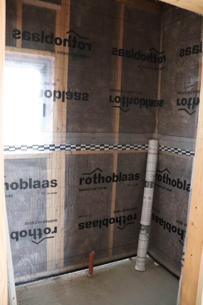
So this is our laundry room right now in the house. Rothoblaas vapor barrier, exposed pipes, and a lot of “trust the process” energy. The bones are there, the decisions are coming quickly, and I’ve been deep in a paint-color research spiral for longer than I’d like to admit.
Here’s something I didn’t fully appreciate until we started building: laundry rooms are actually one of the best places to experiment with paint. They’re small, so the commitment feels manageable. They’re practical, so nobody expects them to look like a showroom. And because they’re often overlooked, even a little intention can make the entire room feel transformed. You just need a color that feels more personal than builder beige, and suddenly you have a space that feels like someone actually lives there and cares about the details.
I’ve been collecting laundry room inspiration for months, and I keep coming back to two directions: sage green and warm white or cream. Since I couldn’t quite picture either option in our exact space, I created a few visual versions of what our laundry room could look like in different colors. Seeing the possibilities side by side helped more than I expected.
I’m sharing the colors, undertones, and ideas I’ve been considering because I’d genuinely love to hear what you think. Sage or cream? I still can’t decide.
Warm Whites and Creams – for a clean but not sterile look
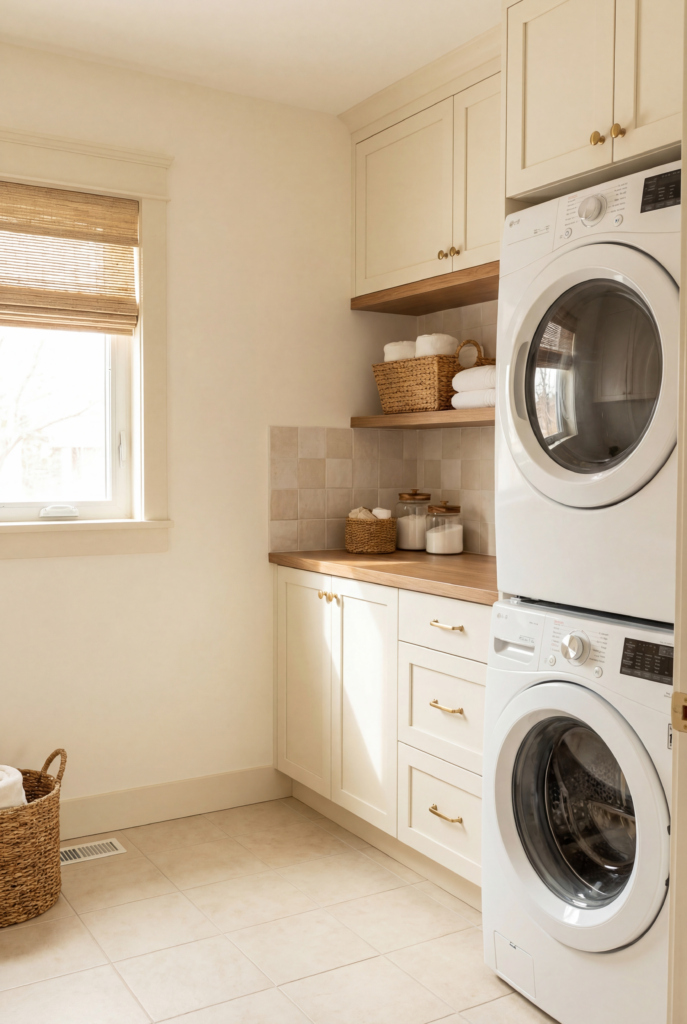
This is one of the two directions I’m seriously considering for our laundry room. I keep coming back to it because there’s something incredibly satisfying about a warm white space that feels clean without feeling cold. The difference between a warm white and a cool white in a small room can be huge. One can feel stark and clinical, while the other feels welcoming, organized, and comfortable. The biggest difference usually comes down to the undertone.
Look for whites with subtle yellow or pink undertones rather than blue or gray. Benjamin Moore White Dove is a classic for a reason. It reads as white in photos while feeling noticeably warmer in person. Chantilly Lace is crisper and can look beautiful when there is plenty of natural light, but it may feel cooler in a darker laundry room. Sherwin-Williams Alabaster is another option I keep noticing in beautiful spaces because it has a soft, slightly creamy quality that makes a room feel finished rather than freshly painted.
Warm whites are especially helpful if you have wood shelving or warm-toned hardware because a cool white can clash with those elements. They also work well when the laundry room connects to another area, such as a mudroom or hallway, because the softer color creates a more natural transition.
For styling, I’d pair warm walls with a washable striped runner in cream and natural tones, woven rattan baskets, simple matte black hooks, and a framed linen or botanical print. If there’s enough counter space, I’d even add a small lamp. It may sound unnecessary for a laundry room, but a little warm lighting can completely change the feeling of the space.
Soft Greiges – for a cozier more upscale look
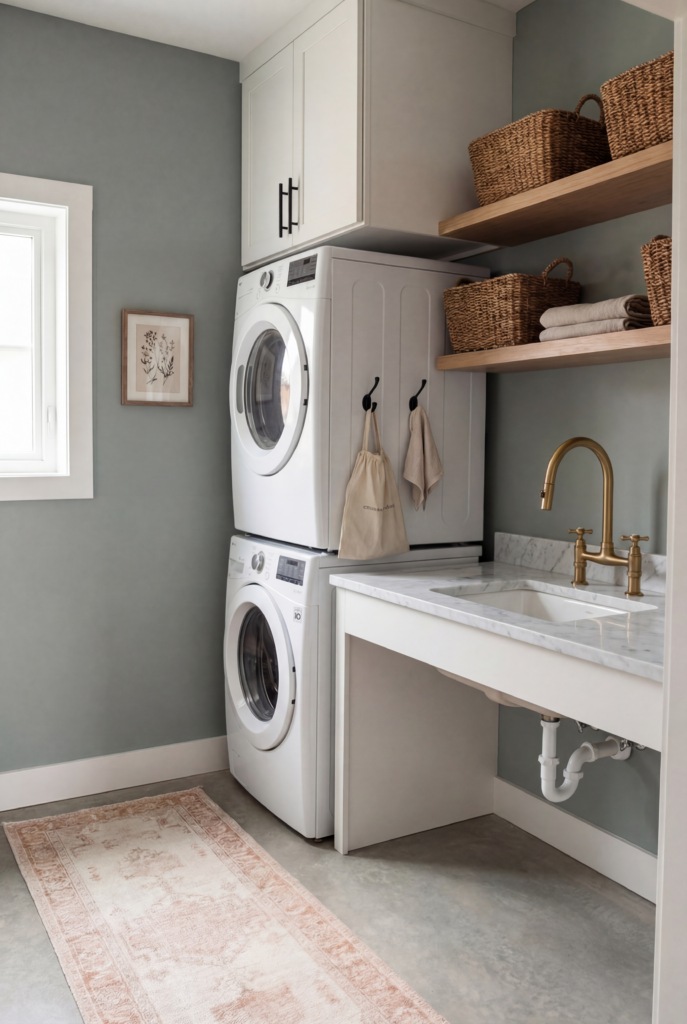
If you want something that feels polished and intentional without committing to a noticeable color, greige can be a great middle ground. The right greige can make a room feel thoughtfully designed, while the wrong one can look like an undecided compromise.
The important thing is to choose a greige that leans in a clear direction. A perfectly balanced gray-beige can sometimes look muddy under artificial lighting, which is especially important in laundry rooms that rely heavily on overhead or fluorescent lights.
Sherwin-Williams Agreeable Gray is popular because it has a warm quality and tends to remain relatively neutral across different lighting conditions. Benjamin Moore Pale Oak is warmer and more beige-forward, giving it a softer and cozier appearance. Sherwin-Williams Accessible Beige adds a little more depth while still remaining understated.
Greige works especially well with white cabinets because the contrast creates definition without becoming dramatic. It can also be useful when a room receives a mixture of natural and artificial light because the neutral undertones tend to be more forgiving than very warm creams or cooler grays.
For styling, I’d use a woven seagrass runner, off-white or natural linen hampers, brushed brass hardware, floating wood shelves, and matching ceramic or glass containers for laundry supplies. Small details like these can make an ordinary utility space feel much more finished.
Muted Sage and Gray-Greens
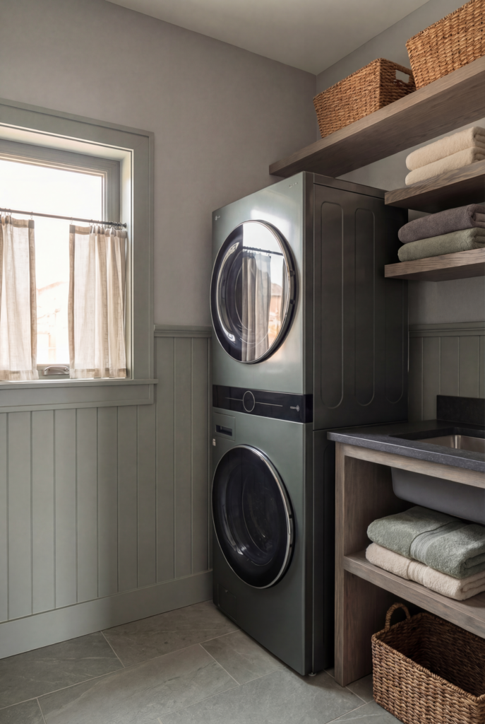
This is the other option I keep coming back to. And when I say sage, I mean a muted, dusty green with plenty of gray rather than the brighter yellow-green versions that were popular several years ago.
The undertone is extremely important here. You want enough gray to make the green feel sophisticated and subdued, rather than bright or overly cheerful. I would also avoid strongly yellow-based greens because artificial lighting can make them look much warmer than expected.
Benjamin Moore Saybrook Sage is a dependable example of a softer, gray-leaning sage. Sherwin-Williams Evergreen Fog is another popular choice because it has enough complexity to shift subtly throughout the day. Farrow & Ball Mizzle is especially interesting because it can appear almost neutral in certain lighting before revealing its green character as the light changes.
Natural light is particularly important with muted sage shades. In a windowless laundry room, complex greens can lose some of their depth and appear flat. That’s one reason I keep coming back to sage for our particular laundry room: we have a real window, so the changing natural light should allow the color to look different throughout the day.
If your laundry room doesn’t have a window, I’d be more cautious with medium-toned sage and other complex colors. Warm whites tend to be more forgiving under artificial light. Another option is to go intentionally dark and pair the color with strong, warm lighting so the room feels cozy rather than simply dim. Medium colors that depend heavily on natural light can sometimes land in an awkward middle ground.
Muted sage works beautifully with white cabinets, white appliances, and white tile. The contrast creates enough interest to make a small practical space feel intentionally designed.
For styling, I’d use a washable cotton runner in cream or soft terracotta, black iron hooks, woven baskets, botanical artwork in simple black frames, and matte black hardware. The darker accents help ground the softness of the green and keep the room from feeling too delicate.
Dusty Blue-Grays
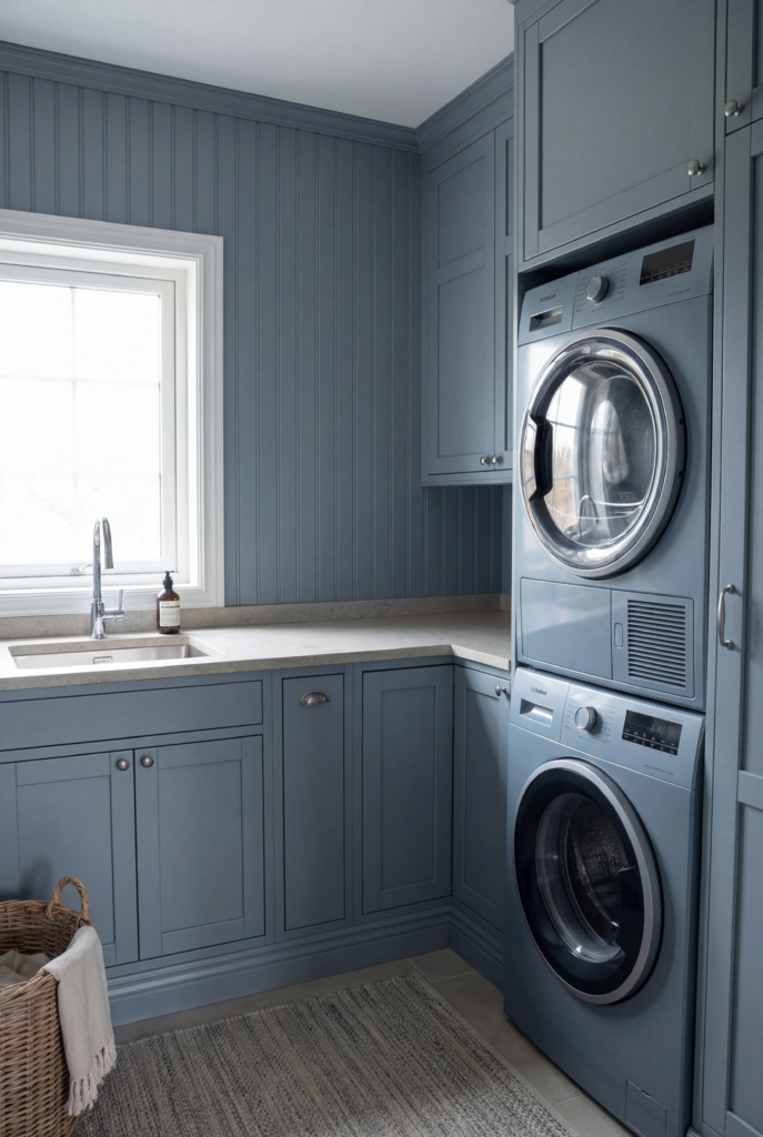
This option might seem unexpected for a small laundry room, but the right dusty blue-gray can make the space feel incredibly calm. Since laundry is already a routine chore, creating a room that feels peaceful can make the everyday experience a little more pleasant.
The key is choosing something dusty rather than bright. You don’t want a vivid blue or a very dark navy. Instead, look for a shade that sits between blue and gray with enough lightness to keep the room from feeling enclosed.
Benjamin Moore Smoke is a beautiful example of a sophisticated gray-blue. Sherwin-Williams Rainstorm is deeper and more dramatic while still remaining livable.
For a windowless laundry room, one interesting approach is to paint all four walls and the ceiling in the same color, then add warm lighting. Instead of treating the lack of a window as something to disguise, the entire room becomes a deliberate, cozy space.
For styling, I’d pair dusty blue-gray walls with a navy or natural striped runner, white ceramic hooks, cream woven baskets, and simple artwork in a black frame. If you have open shelving, white shelves can work especially well because they create crisp contrast against the cooler wall color.
The Moody Dark Option
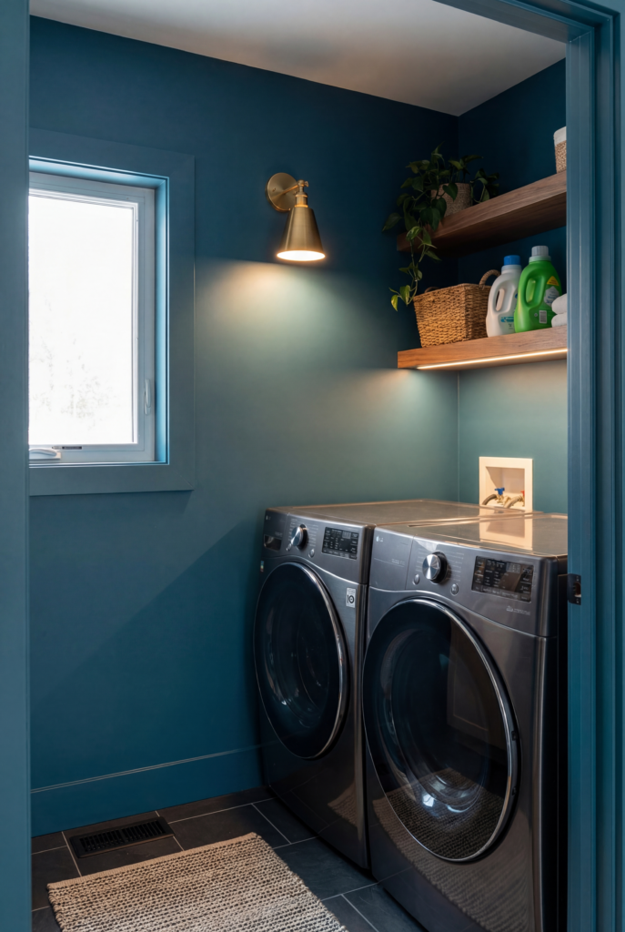
I’m including this because some of the most beautiful laundry rooms I’ve seen have embraced dark paint instead of trying to make the space look brighter.
Farrow & Ball Hague Blue is a deep teal-navy that manages to feel both traditional and contemporary. Sherwin-Williams Iron Ore is a deep charcoal with subtle warmth that can read almost black without feeling completely flat. Benjamin Moore Black Forest Green can also look striking when paired with brass hardware and natural wood.
This direction works best when you’re willing to fully commit. Dark walls look intentional when the rest of the room supports them rather than trying to soften them halfway.
Think crisp white accents, warm brass hardware, natural wood, good lighting, and minimal visual clutter. The goal is not to make the room feel bigger. It’s to make the small size feel deliberate and atmospheric.
So Where Am I Landing?
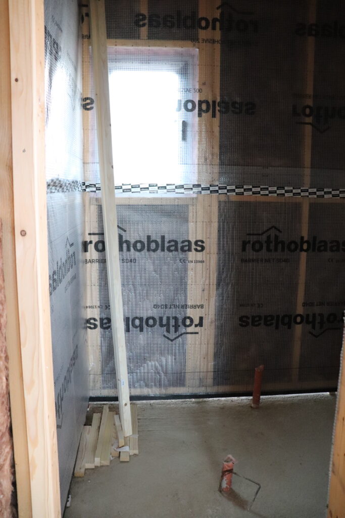
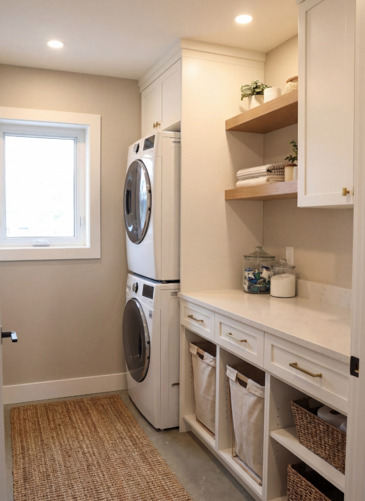
Honestly, I’m still stuck between the sage and the warm cream. The sage feels more exciting and more like what I’m drawn to right now, while the cream feels timeless, flexible, and forgiving. Both qualities matter, especially in a room that will be used constantly.
The sage would look beautiful with the white cabinets we’re planning, while the warm cream would connect more naturally with the other spaces in the house. Having a window makes both options realistic, which might actually be making the decision harder because neither choice feels obviously wrong.
A few things I know for certain regardless of which direction I choose: test every color in the actual room, especially during the evening when artificial lighting can completely change the appearance. Hold a clean white piece of paper next to each sample so you can see the undertones more clearly. And pay attention to the surrounding finishes, because flooring, cabinets, countertops, hardware, and lighting can all influence how a paint color looks.
But seriously – sage or cream? Have you used either color in your laundry room? I’d genuinely love to hear what worked for you.
What is the most popular laundry room paint color right now?
Muted sage greens are especially popular right now, with shades such as Evergreen Fog appearing frequently in laundry room inspiration. If you prefer something more timeless, neutral choices such as Agreeable Gray and White Dove remain dependable options. However, popularity matters less than how the undertone works with your specific lighting and finishes.
What color makes a laundry room look bigger?
Warm whites and soft creams are classic choices for making a small laundry room feel more open. The warmth is important because a cool white can sometimes look stark rather than airy. Another option is painting the ceiling the same color as the walls, which can create a more continuous and intentional look.
Does it matter if my laundry room has no windows?
Yes, it can make a significant difference. Muted sage greens, dusty blue-grays, and other complex colors often benefit from natural light because it helps reveal their undertones and depth. In a windowless room, warm whites can be easier to work with. If you prefer a darker color, committing fully and pairing it with good warm lighting can also create a cozy result.
Is it worth decorating a laundry room at all?
Absolutely. Laundry rooms are usually small, which means updates can be relatively affordable and quick. Since it’s a room you use regularly, even simple changes can make a noticeable difference. A runner, some hooks, thoughtful storage, and the right paint color can turn a basic utility space into a room that feels comfortable and intentional.